Content Design
Bringing Mint members to Credit Karma
Mint was going away, and its members were being walked through a funnel into Credit Karma. My job was making sure the experience was warm, informative, easy to understand, and familiar—minus the budgeting feature most of them came to Mint for in the first place.
- Role
- Content Designer II
- Partners
- Product design, product management
- Surface
- Onboarding + at-a-glance finances
- Constraint
- Familiar, without the marquee feature
What I builtThe work
A content strategy that held two conflicting messages at once
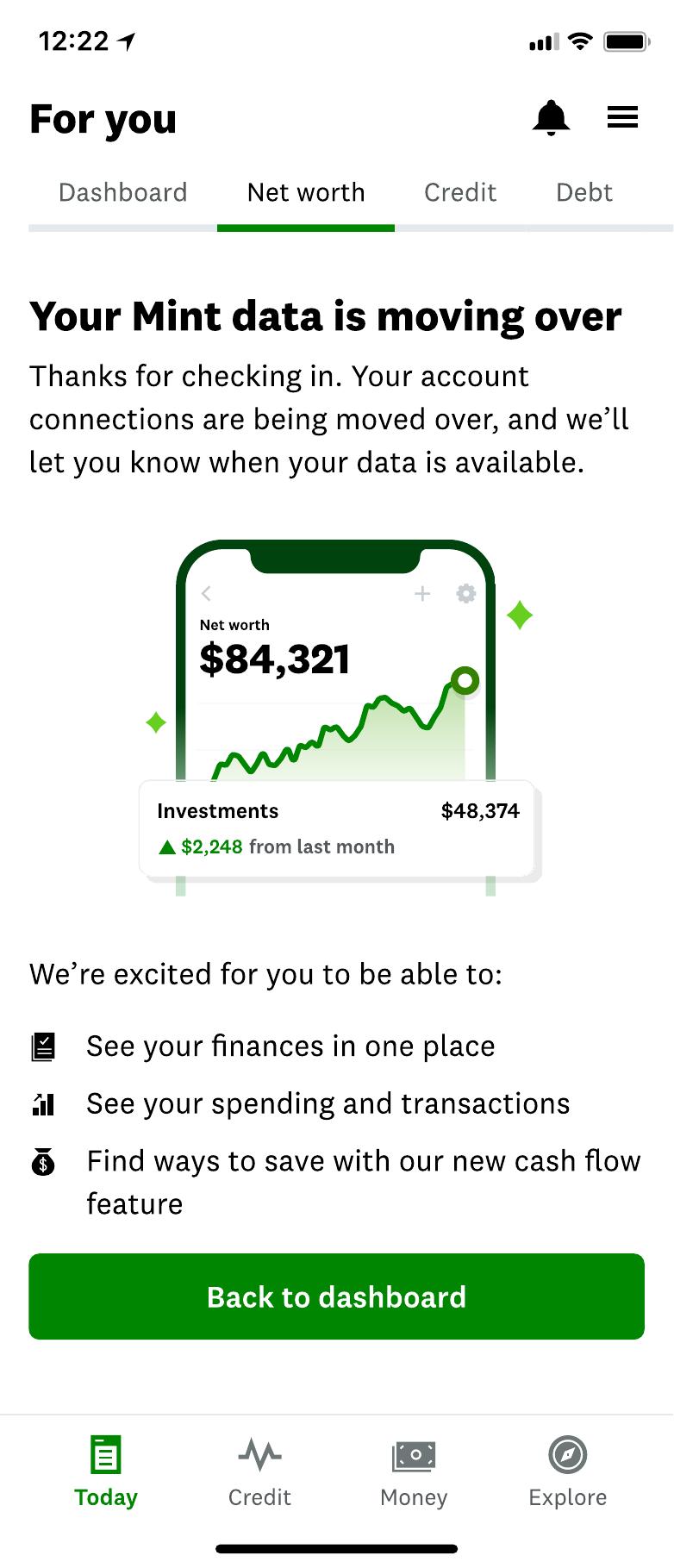
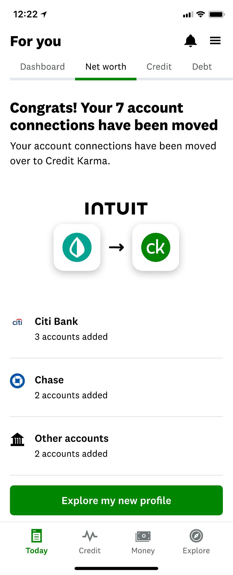
Mint members were loyal in a way that's rare for a finance app. Many had years of categorized transactions and a budgeting habit built around it. When Mint went away, they were offered a path into Credit Karma—and we designed an at-a-glance finances experience modeled on what they knew: net worth, spending, cash flow, subscriptions, all in one view.
Budgeting wasn't part of it.
So the content had 2 jobs at once. It had to make the new experience feel legible and worth staying for, and it had to be honest about what wasn't there—early enough that nobody discovered it 3 weeks in and felt tricked.
Here's what that looked like in the actual product, from the upsell that started the migration to the confirmation that closed it out.

How I built itApproach
I had to lead with specificity
The instinct in a migration is to lead with reassurance—everything you love, now in a new place—and it's a mistake, because the first thing a member does is go looking for the thing they love. The correction is to be specific about what the new experience actually does, in the member's own vocabulary, and let the specificity do the reassuring.
Practically that meant a few things:
- Writing the at-a-glance view around what a member would recognize on sight—their net worth, where their money went, what's recurring—rather than around what the product team called those features internally.
- Keeping a controlled vocabulary across the finance surfaces, so a term meant one thing everywhere. In an app where the same number appears in 4 contexts, inconsistent labels read as inaccurate data.
- Setting expectations during the transition rather than after it, so the absence of budgeting was information a member had before they invested effort, not a discovery.
Reassurance without specificity is just an empty promise.
WhyThe reasoning
It was important to build trust through transparency
People hand a personal finance product an enormous amount of trust—every account, every transaction, the whole embarrassing picture. That trust isn't built by a great onboarding flow; it's built by the product never once being cagey with them.
There was also a straightforward design argument. If members arrive expecting budgeting, every subsequent screen gets read as a failed budgeting tool. If they arrive understanding this is an at-a-glance view of their finances, the same screens get read as what they are.
OutcomeWhat I took from it
Structure comes before phrasing
The experience shipped, and two-thirds of active Mint members carried over into Credit Karma.
This experience changed how I work. Almost none of the hard problems here were sentence-level. They were about sequence—what a member learns and when—and about vocabulary consistency across surfaces owned by different teams. The writing was the easy part once those were settled, and impossible before.
That realization is the straight line from here to everything else on this site. Once you've noticed that the content problem is really a structure problem, you start wanting to fix the structure, and eventually somebody gives you a program to run.
Next
The Mint Content Library →